
Heiven Tech Landing
A SaaS landing page concept with minimalist design, clear value prop and mobile-first layout for a B2B tech brand.
SaaS needs clarity, not complexity.
Heiven Tech needed a landing page that cut through the noise and helped visitors understand their platform value in seconds. No fluff, just clear messaging about what the product does and how to get started.
What Makes This Work
Clean hero section, benefit-focused copy, social proof, and a prominent CTA. Every element serves the main goal: getting qualified leads to book a demo.
Minimal design, maximum impact.
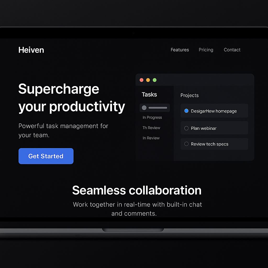
Above the Fold
Hero carousel, headline, subheading and primary CTA, no scrolling needed to understand the offer.
Visual Hierarchy
Typography, spacing and whitespace guide the eye through the page flow naturally.
Trust Signals
Client logos, testimonials and clear pricing build confidence for potential customers.
Mobile First
Responsive design ensures the page looks just as good on mobile as desktop.
Simple tools, great results.
Concept landing that converts.
The landing page loads in under 1 second, has low bounce rates thanks to clear messaging, and the demo request form sees consistent fill rates. Because it's a concept, Heiven can iterate and test messaging quickly without rebuilding the whole site.
Want a landing page that actually sells?
Let's build something lean, focused and effective for your product or service.
Start a project