
FractionX Website
A polished corporate website for a property and services brand, built to present services, projects and contact paths with a clean responsive layout.
A clear digital presence for a service-led brand.
FractionX needed a website that could present services, projects and trust signals without feeling crowded. The structure had to guide visitors from the home page to the services and project sections, then into a contact-ready conversion path.
Navigation flow
Clear menu structure helps visitors move between the home, services and project sections quickly.
Service clarity
The site presents the business as a reliable partner with a wide but easy-to-scan service offering.
Visual credibility
Large imagery and consistent section spacing help the brand feel more polished and trustworthy.
Responsive layout
Content stays legible and balanced across desktop and mobile screens without sacrificing polish.
Service cards that make the offer easy to understand.
Building Compliance
Plans, permits and regulatory support presented in a straightforward, professional way.
Training & Workshops
Workshop-focused messaging that highlights expertise and educational value.
Real Estate Analysis
Insight-led services supported by clear layout and data-friendly visual hierarchy.
Construction Services
Project capabilities presented with confidence and enough space to breathe on every screen.
Project Management
A final service card that reinforces the brand as a complete end-to-end partner.
The interface balances story, trust and conversion.
Clear calls to action
Contact prompts stay visible enough to guide visitors without overwhelming the content.
Mobile-first spacing
The layout keeps text blocks, images and buttons comfortable to use on smaller screens.
Project presentation
Large image sections help the project work do the talking and make the brand feel established.
Reusable structure
Consistent section patterns make future updates and new pages easier to maintain.
A closer look at the finished screens.
The gallery repeats the strongest views from the homepage, services and projects areas so the presentation feels complete and easy to evaluate.
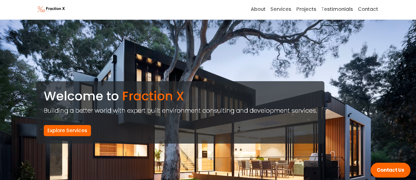
Homepage Hero
Strong first impression with a clear offer and a prominent contact path.
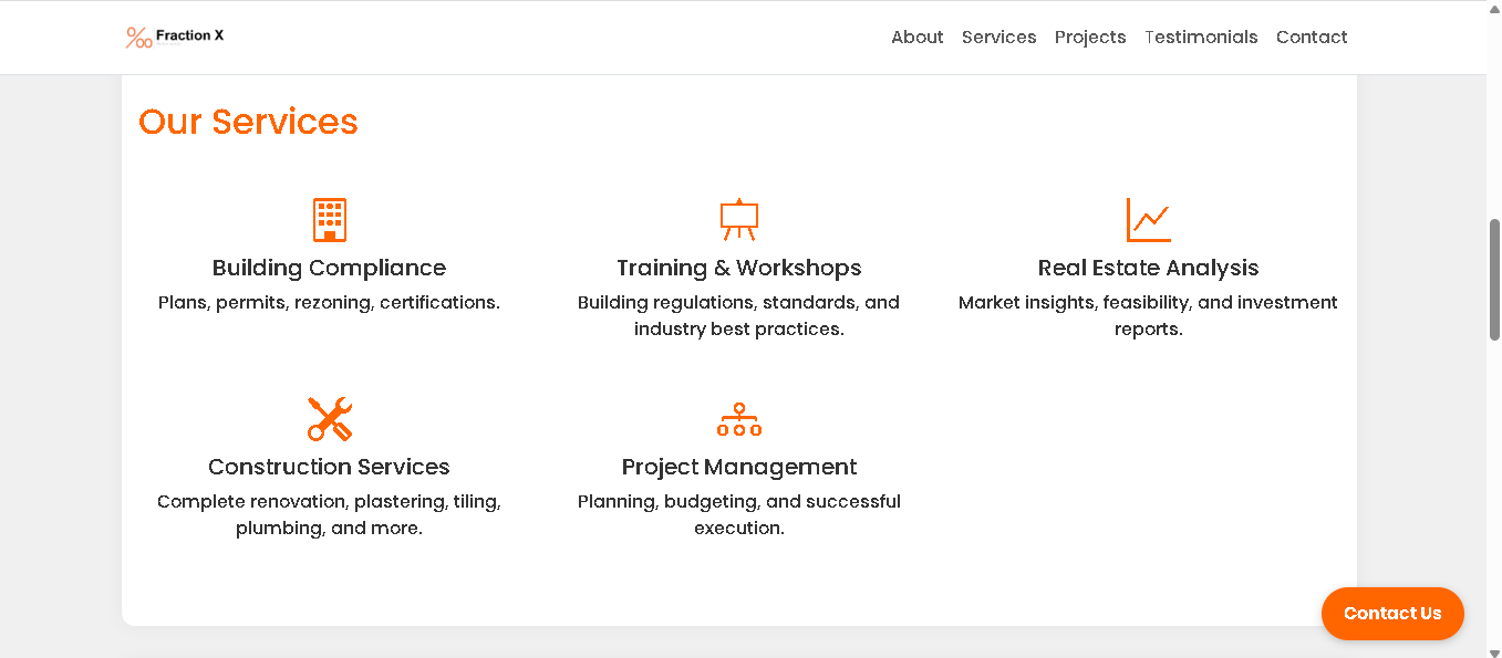
Services Section
A neatly spaced service grid that makes the brand offering easy to scan.
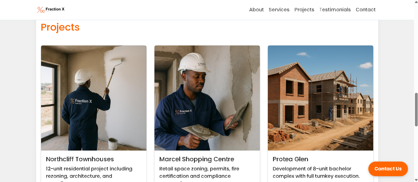
Projects Section
Project imagery that supports trust and shows the work in context.
Contact Ready Layout
A second crop of the homepage keeps the gallery at four images and adds variation.
A more trustworthy website with a clearer path to enquiry.
Stronger brand trust
Large visuals and cleaner spacing make the brand feel more established.
Clearer service story
Visitors can understand what the business does without reading dense blocks of copy.
Better mobile usability
The page stacks gracefully so the presentation still feels polished on smaller devices.
Improved conversion flow
Contact actions are easier to find, giving visitors a clearer next step.
Need a website that presents your services properly?
Let's build a responsive brand experience that helps people understand what you do and how to get in touch.
Start a project